
In Engineering, a lot of calculation are based on graph/chart. Graph/chart is a crucial thing in this field. It is like a module in programming. We need to use graph/chart to obtain certain functions or sometime just certain values.
Obtaining a value from a graph/chart is not a hard task to do, but it’s kinda time consuming and requires extra concentration (especially your eyes). When it comes to solve a lot of calculation, the problem arise. We need something more simple. One of the solution is we can use a function to generate numbers.
But how do we transfer a graph to a function? Is it even possible?
Sure! It is possible. The principle is pretty straightforward, we just need to extract data from the graph/chart as many as we can, and then generate a graph/chart from that data in Excel (or maybe Python). Lastly, we just have to create a trendline based on generated graph/chart.
Get the picture? It’s okay if you don’t, because in this article I’ll show you how to do this step-by-step. But before we start, you need to prepare these tools:
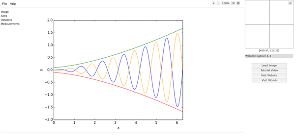
Ready? I don’t think so, you also need a sample graph or chart or plot that we can use as example data (I recommend to use a simple plot just for practice). If everything has been prepared, follow guide below:
- Open the graph reader tool.
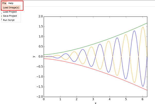
- Insert your graph/chart by clicking File > Load Image (s).
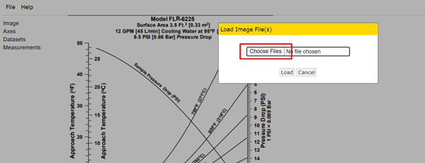
- After that, a pop-up window will show up, and click Choose file to open a file dialog where you can select the graph/chart that you want to extract the data.
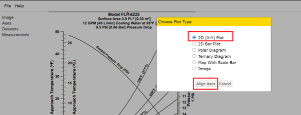
- Another pop-up window will show up, in this window, you are given a choice what kind of graph/chart is your graph/chart. Mine is 2D (X-Y) Plot. Just select one of them, and press Align Axis button.
- Next thing to do is aligning the axes. You can use this message as your guide to align axes.
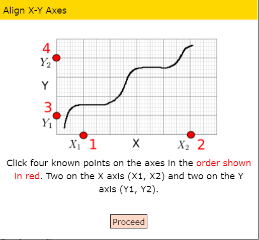
- Aligning axes is quite simple, you just have to put 4 points at the graph (click to put a point). The 1st and 2nd point is the minimum and maximum scale of your X-axis, while the 3rd and 4th point is the minimum and maximum scale of your Y-axis. See example below. You can use the magnifier tool at the right-top of window to put a precise point.
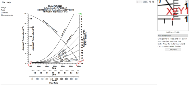
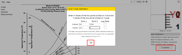
- Next, click Complete button and a new pop-up window will show up. In this window you will asked to enter values of the point clicked on X-axis and Y-axis. As my explanation before, Point 1 is the minimum scale for respective axis and Point 2 is the maximum scale for respective axis.
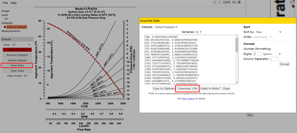
- Last thing to do with the graph is extracting the data. In this tutorial I’m going to show you how to extract data from the graph manually. This step has goal to add point as many as possible to your graph, where the point added here will the extracted data. You can see the box at the right side of the window, and select Add Point (A) to add a point to your graph, or Delete Point (D) to delete a point at your graph. Pro tip: the more point you add, the more precise your later generated function are going to be.
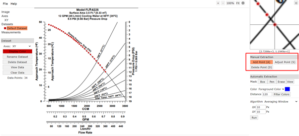
- The data is ready now! Click on the View Data button on the left side, and then you can see a dialogue showing your extracted data. You can download the data as .CSV too.
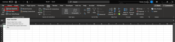
- Now we are done with the data extraction. Let’s move to spreadsheet application. After you open your favourite spreadsheet application, import your CSV (or extracted data) to the spreadsheet (this article might helpful if you never import any CSV to Ms Excel before).
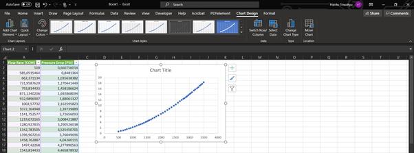
- After the data imported to your spreadsheet, create a scatter-type chart from it.
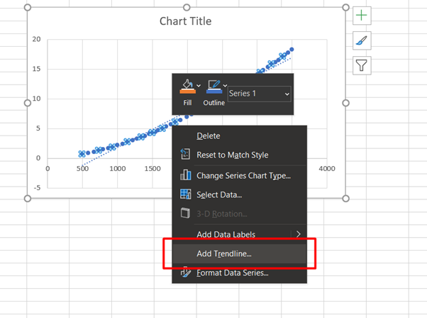
- Right click at the generated chart, and then click Add Trendline.
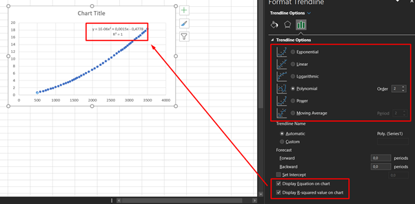
- A format trendline menu will show (if it doesn’t show up, right click on the trendline, and click Format Trendline). This is a bit tricky, you should try to use a different mathematic model to see which model best-fit with your data. You can use trial and error method to see which model fit the best by displaying equation and R-squared value on the chart and then try all available models (R ≈ 1 means perfect model). In this case I’m choosing Polynomial Order 2 as the model.
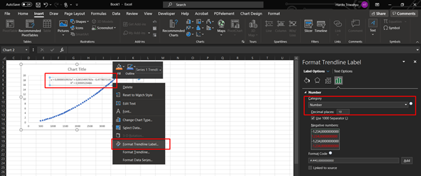
- Last problem we have to solve here is the equation displayed on the chart are simplified. In order to solve this, simply right-click on the equation and click Format Trendline Label. Change the category to Number and the decimal places to any length of decimal you want (in this case, I’m using 10 decimal places).
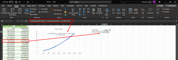
- Voilà! Now you have the function that can replace your graph. You can use this function instead of reading your graph.
I hope this tutorial help you a bit in solving a problem in calculation. This tutorial helped me to create a calculator programmed with Excel and VBA at which the data that I needed only available in graph/chart. Happy learning! And don’t forget to share this tutorial to your friends or colleagues! If you find any mistakes in my tutorial, please don’t hesitate to let me know by dropping your comment below or you can contact me on e-mail ;)
Power is gained by sharing knowledge, not hoarding it.


Leave a comment